A condominium renovation in natural materials for a client who had long lived abroad. So that everything would sit well with their much-loved designer furniture, we examined each material one by one—its dimensions, how it would read, its texture.

The House of Tuned Materials
Data
- Completed
- 2025
- Primary Use
- Residence
- Project Type
- Renovation
- Structure / Scale
- Reinforced concrete, 24 stories above ground
- Total Floor Area
- 86.44㎡
- Architects
- Takeshi Shikauchi + Masako Shikauchi
- Custom Kitchen
- TIDEA
- Contractor
- Ogawa Kyoritsu Construction
- Photography
- ©Yasu Kojima
- Film
- R1996 Inc.
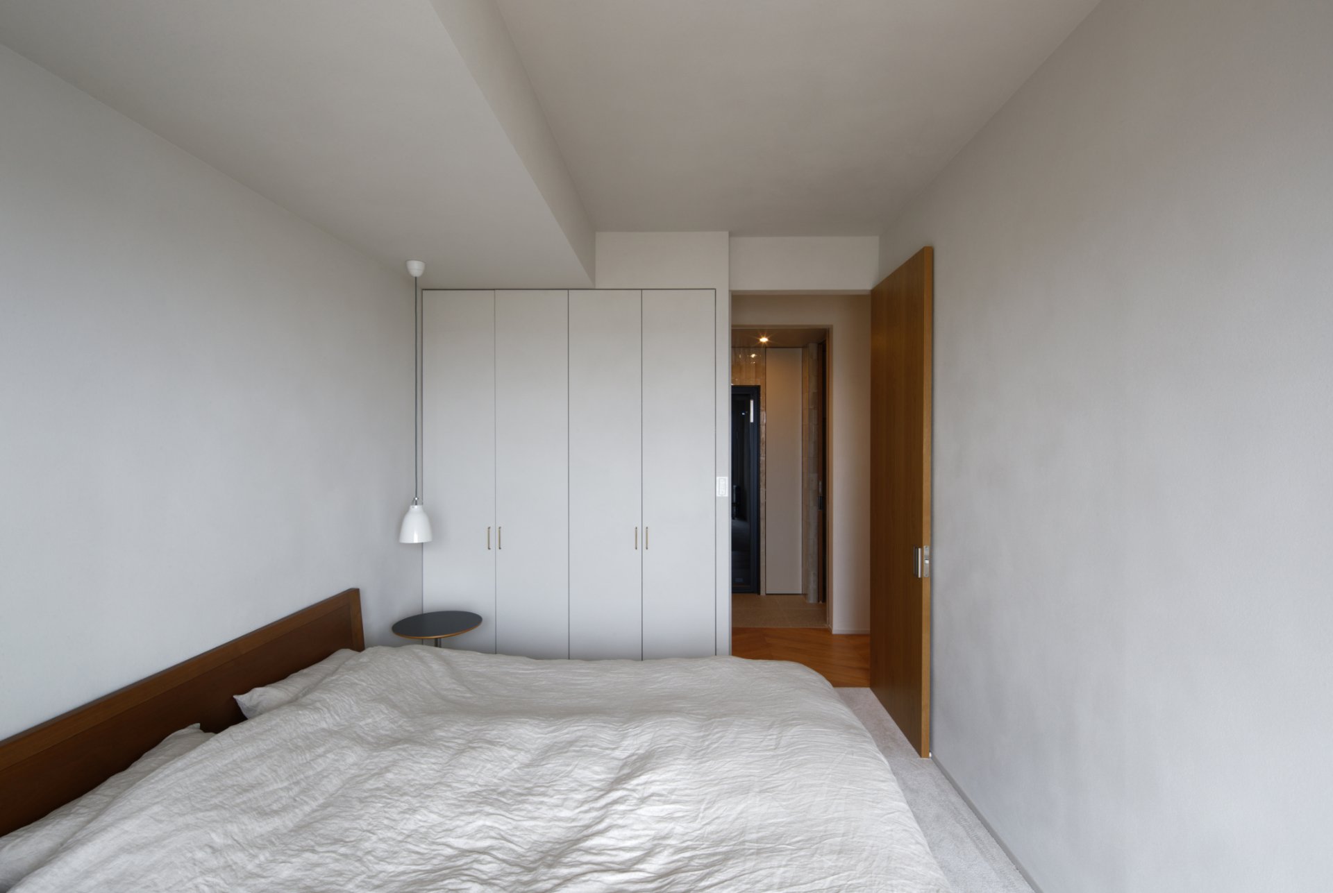
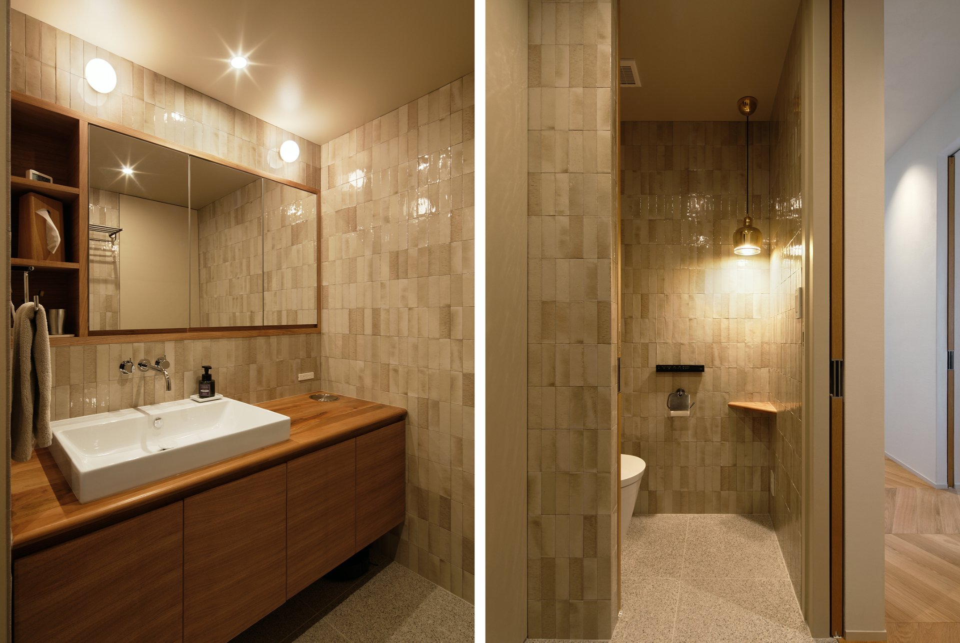
3LDK → 2LDK
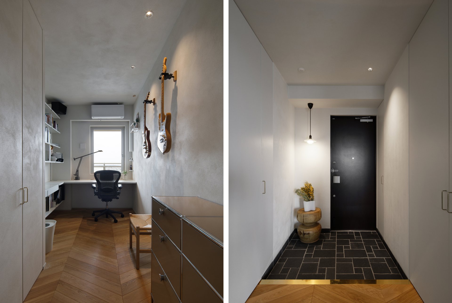
“There are many rooms, but in the end they had become storerooms”—that was the situation. Considering the family and the way they work, it seemed best to have one bedroom, to make a study both could use, and to allot one room to the LDK and other areas.
The place abroad where they had lived before was, it seems, pastoral rather than urban. Living in an old house more than a hundred years old, they had come to feel the goodness of aging firsthand; but after returning to Japan they could never quite get used to the new manufactured materials of the apartment they lived in, and so, it seems, resolved to buy the apartment they had been renting and carry out a full renovation. In it, they asked to enjoy the flavor that only the real thing has—selecting, for the plaster of the walls and the herringbone, materials in which even cracks become part of the character.
A Sense of Scale
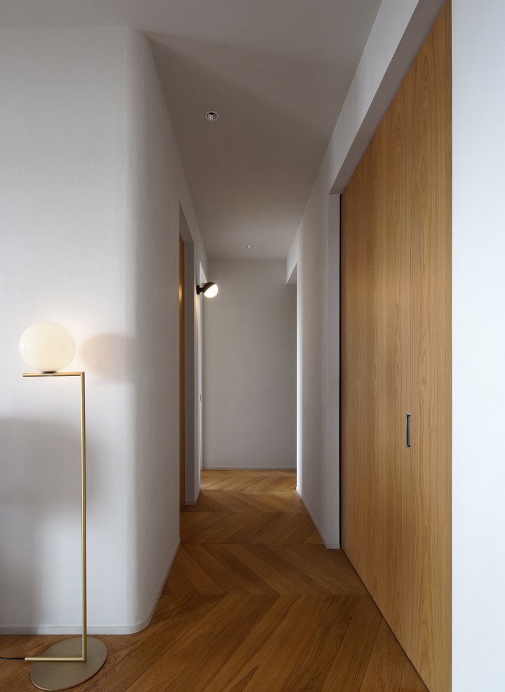
They asked us to secure, as far as possible within the limited space of an apartment, the corridor widths and interior ceiling heights seen in Japanese houses. In apartments, a large space above the ceiling is often hidden for ease of construction, so we proceeded by checking the as-built drawings and the like. We also partially demolished areas to survey the pipe routes as we designed.
A Wall Lit by the Western Sun
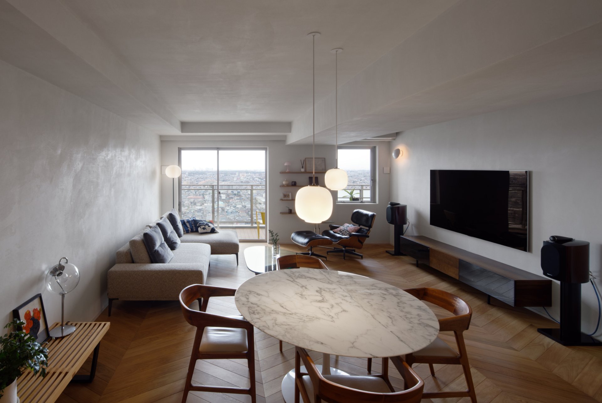
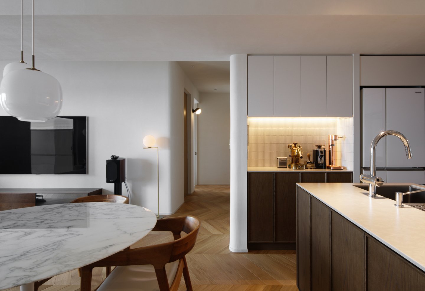
Ordinarily, a tower apartment stands among other buildings of similar height, but from this unit’s windows, low-rise houses spread out as far as the eye could see. The client had lived in the same place before the renovation and had said, “It’s good that the western sun reaches deep inside,” so we felt the south wall of the LDK would be an important wall in this interior.
Harmony with the Client’s Collection of Furniture and Lighting
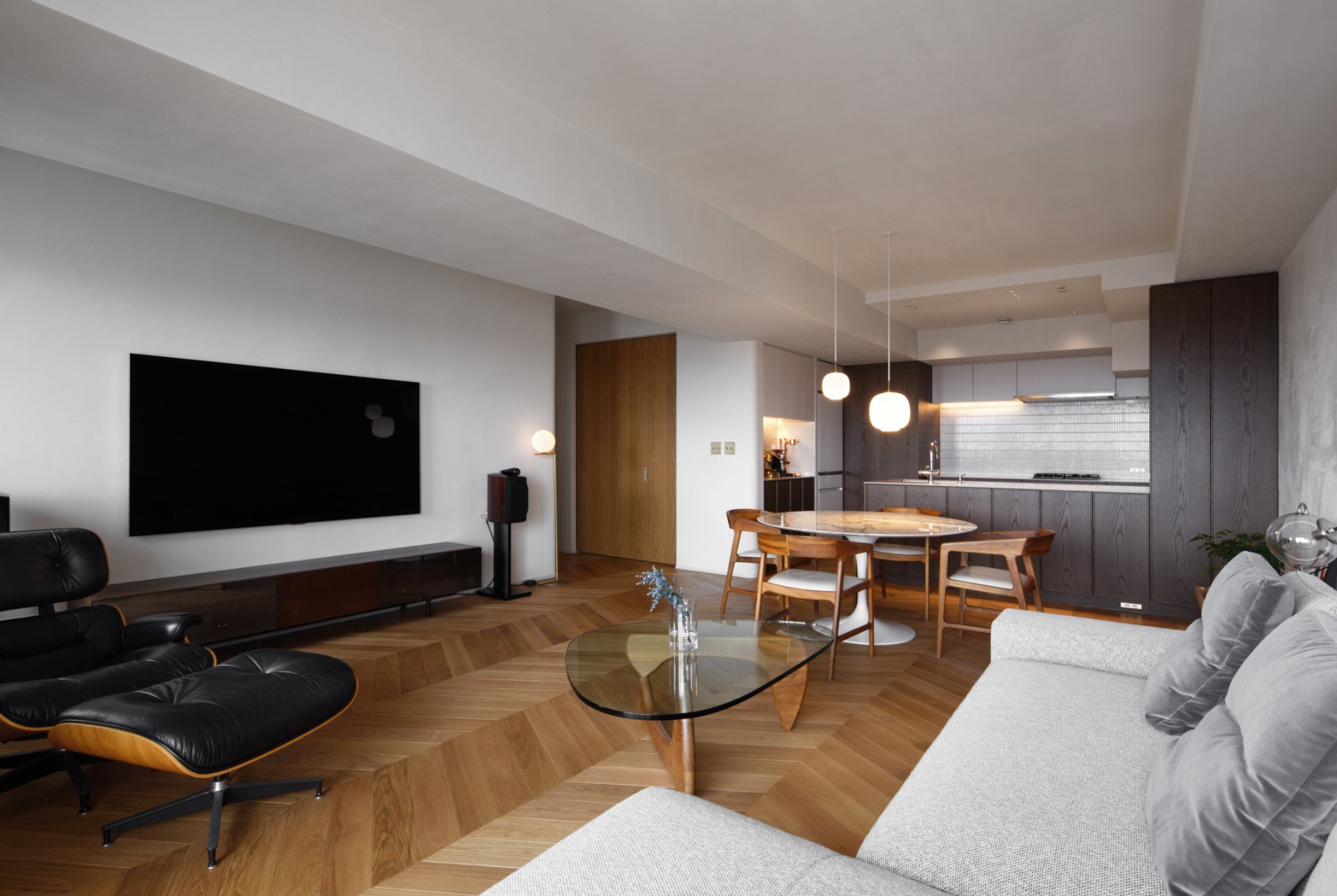
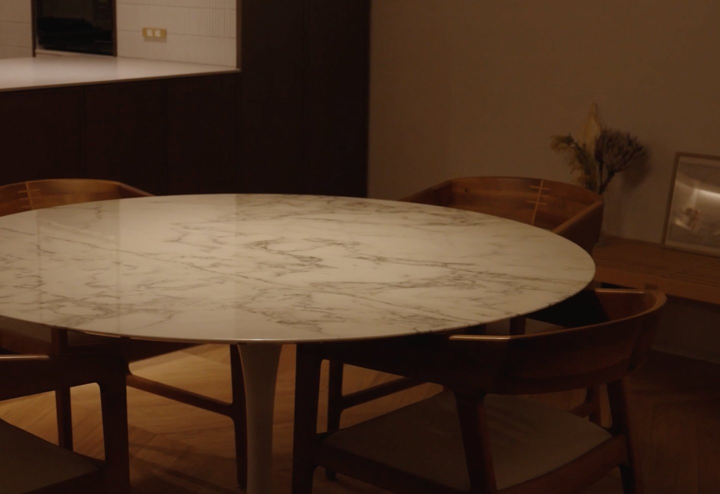
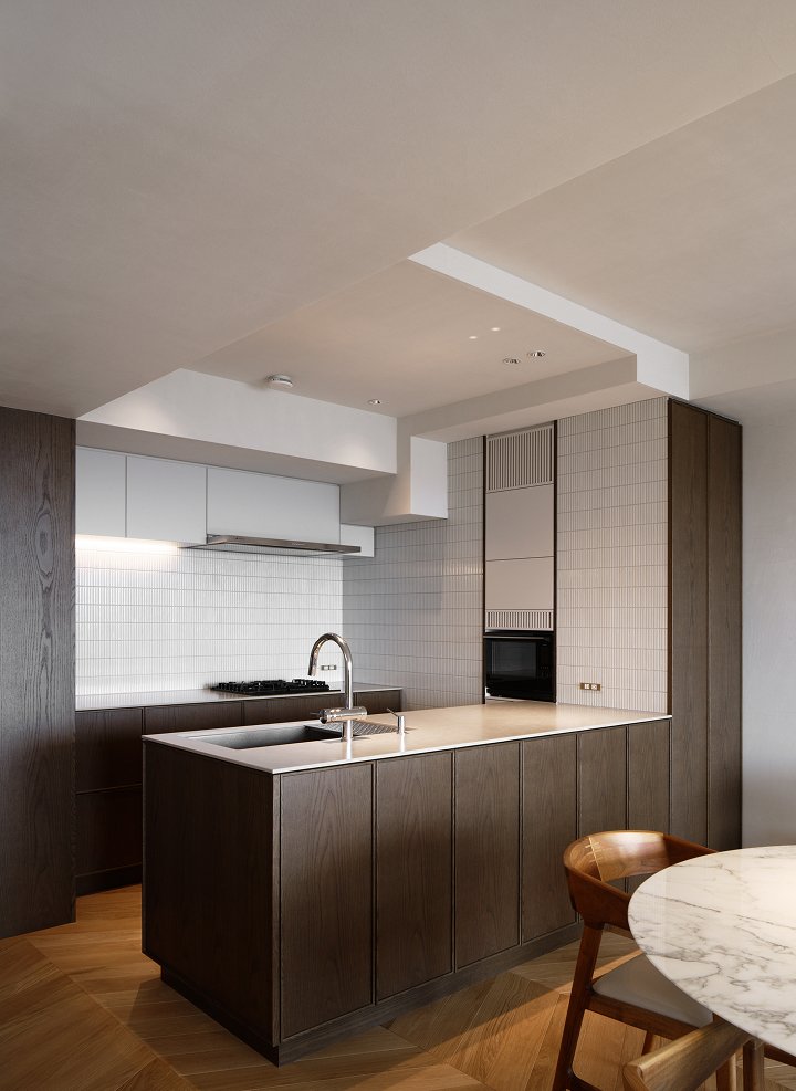
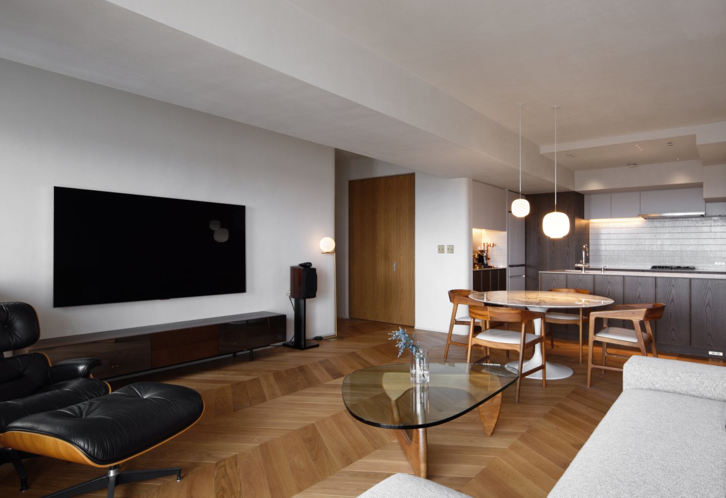
The client had spent time buying and collecting favorite pieces of furniture and lighting. It had also been decided that an Eero Saarinen table would be purchased to coincide with this renovation. With these richly characterful pieces arrayed in the living-dining, we discussed with the client many times over what sort of material quality the kitchen should have.
A Corridor as an Extension of the LDK
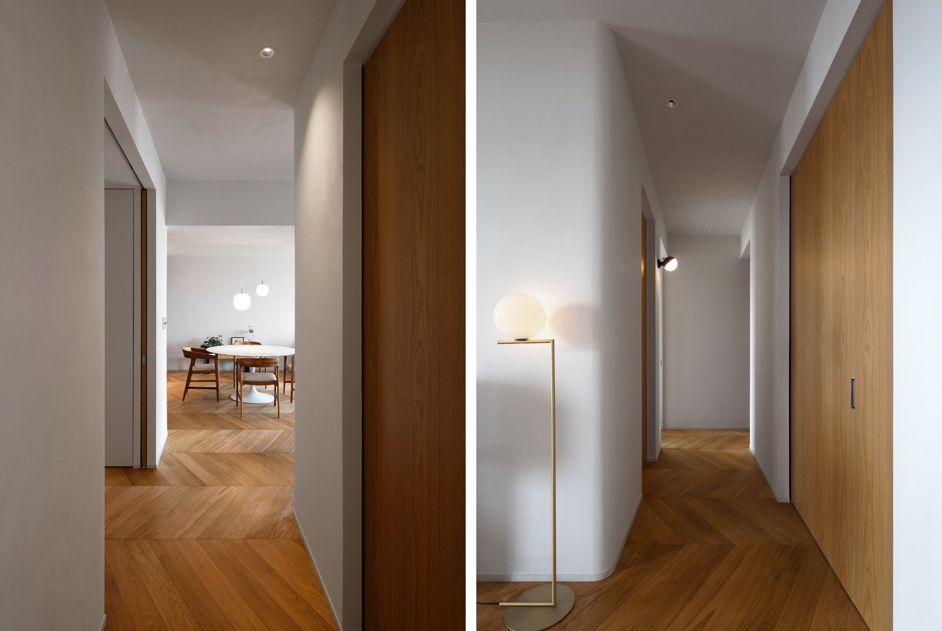
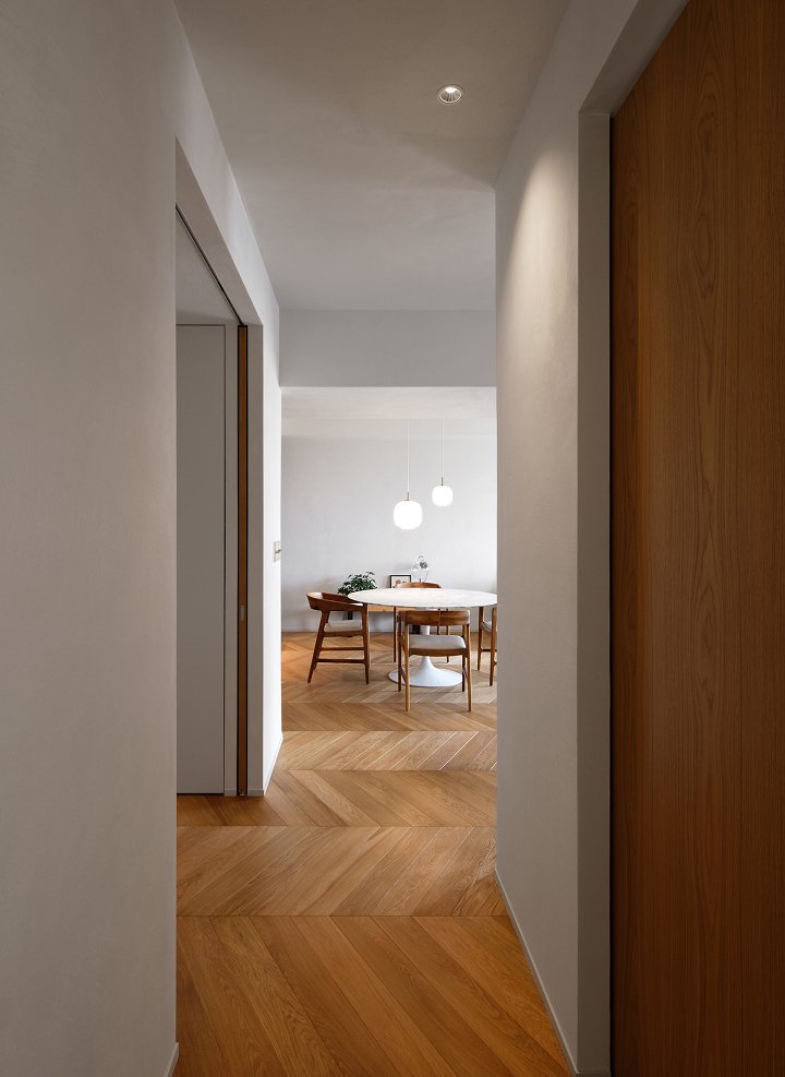
The corridor was given a relaxed sense of scale—1m clear width and a 2.67m ceiling. We also removed the door that would ordinarily be set between the LDK and the corridor, treating it as an extension of the living room. A corridor inevitably becomes a functional place of passage, but since this one is an extension of the LDK, a place of relaxation, its lighting plan and wall materials are the same as the LDK’s. The idea of making part of the wall a curve so that the LDK’s light wraps around was the client’s own. We also proceeded with the design mindful of the scene—glimpsed as if framed slightly by the wall when stepping out of the bedroom or study—of the setting sun striking beyond the Saarinen table.
Topics_01
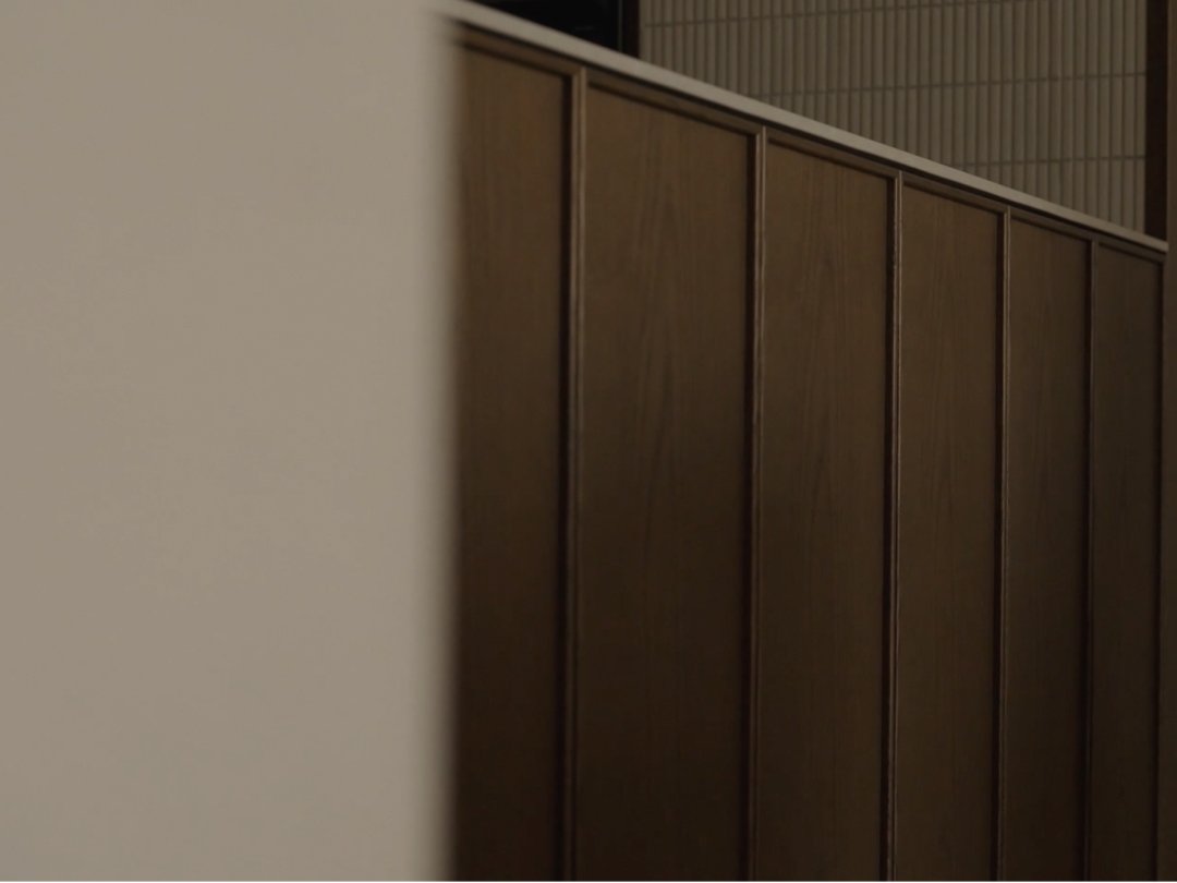
A Kitchen Like a Piece of Furniture
For the kitchen adjoining the characterful designer furniture, we made samples again and again to verify the design and material quality of the door panels and the height of the plinth—the support member at the base. Since dyed oak door panels differ in the feel of their grain depending on the veneer, we visited the veneer maker’s factory and selected from many samples. The dyeing and the dimensions of the frame members were finally decided after the custom-kitchen maker produced more than forty samples.
Topics_02
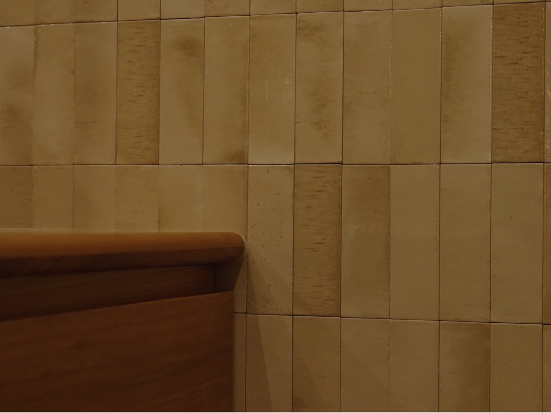
A Remake That Carries On Time
In an interior renovated with materials that reward long aging, surrounded by designer furniture and lighting of universal goodness—materials and furniture to share a long time with from now on—the washroom counter is a remake of a dining table the client had used before. It was not, it seems, from a particularly famous maker; it had been bought in the Netherlands. Noting that they had liked its feel—the curved machining of the edges and so on—a furniture craftsman carefully adjusted its warping. For the door panels, we used walnut veneer similar in texture and color to the counter material, creating a sense of unity. The small counter in the toilet uses the same remade material. It takes effort and expense, but we proposed it out of a wish to carry on, in a new form, the time the client had already spent together with it, into the time to come.
Topics_03
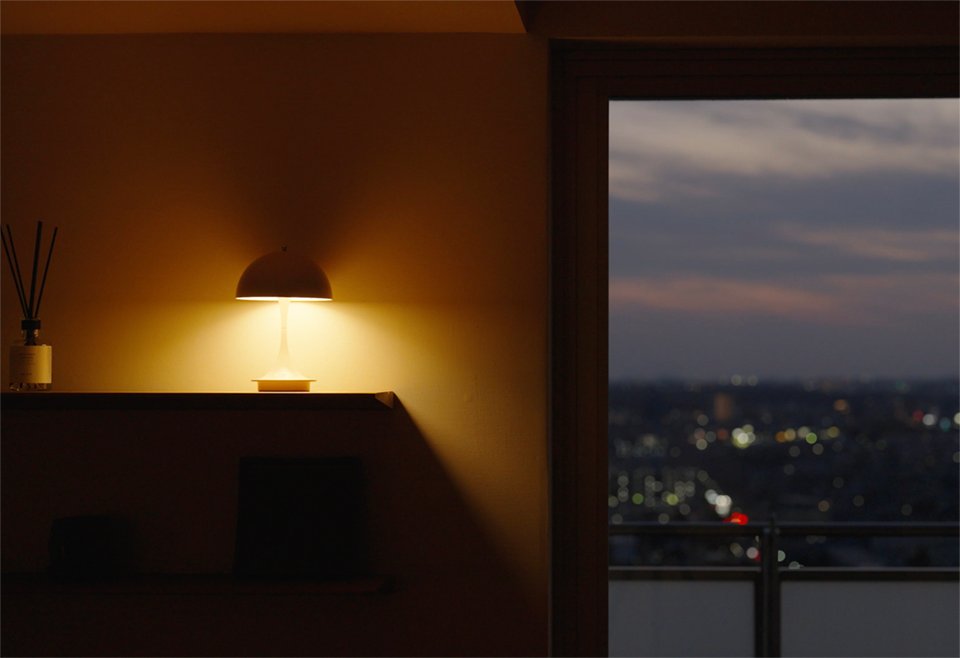
Enjoying Dimness
In this renovation, in order to enjoy the colors and material qualities, the conversation turned to whether it might be better—rather than seeking brightness—to be a little dim. For that reason, the downlights set into the ceiling were kept to the necessary minimum, with the light chiefly from floor lamps, pendant lights, and wall brackets. After the setting sun has dyed the interior, they seem to spend their days relaxing quietly in a room of somewhat lowered light.